Climate and Health
Ocean Simulation Development
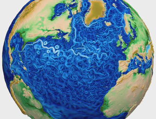
The Model for Prediction Across Scales (MPAS) is an effort to model oceans, land ice, sea ice, and atmosphere for use in climate research and weather studies. The components are integrated in the Energy Exascale Earth System Model (E3SM). MPAS-Ocean is the ocean component of this model, which operates at mesoscale (sub 1km), and which offers local mesh refinement using using Spherical Centriodal Voronoi Tesselations (SCVTs) (unstructured tesselations consisting of 12 pentagons and a lot of hexagons to cover a sphere – a soccer ball is the most minimal example of such a tesselation).
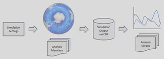
During my involvement with this project, the active efforts included the development of new analysis members (simulated variables), and the addition of a mask-based method to enable the output of only a region of interest of the ocean. This can save massive amounts of time (for I/O) and storage space when running the simulation for centuries.
- Implemented “analysis members” (output variables) for MPAS-Ocean (Model for Prediction Across Scales) in Fortran90. in collaboration with physics and oceanography experts.
- Converted global methods to mask-based regional methods.
- Validated and visualized simulation outputs using charts and maps.

Compression of In-Situ Simulation Data
Climate research monitors many different spatial and temporal scales to assess future impacts. Centuries of climate simulations are run with very high resolution (1–10 km gridcells) ocean, sea ice, and atmosphere components. The petabytes of outputs can overload storage systems and hinder visualization and analysis. One way to mitigate this impact is to produce image databases of rendered results by performing in-situ visualization while the simulation is running. ParaView’s Catalyst component ties into the simulation to intercept intermediate results and produce these image databases. The image databases are an order of magnitude smaller than the raw simulation outputs.
The goal of this project was to assess if the output can be further compressed, and study the cognitive quality of the resulting images.
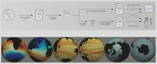
- Developed a workflow to connect the group’s work on energy measurements, algorithms, and cognitive evaluation.
- Produced image databases of climate data using in-situ visualization during large-scale MPAS-Ocean simulation runs (ParaView/Catalyst).
- Encoded and compressed image databases into MPEG-4 files.
- Analyzed the impact of different traversal methods, video encoding parameters, and compression on database size, image quality metrics, and access speeds.
- Supported conduction of a user study to evaluate the cognitive quality of images after encoding and compression using A/B testing.
- [Compressing In-Situ Simulation Data](../../publications/ berres2017vidcompression)
- User Testing to Determine Cognitive Impact of Compression
Energy-Water Nexus
There are different ways to use water to produce energy (e.g., hydropower and wave power). Simultaneously, some energy production uses water for cooling (e.g., nuclear). This project’s goal was to build a web tool to analyze the interdependency of energy and water, using the World Spatiotemporal Analytics and Mapping Project (WSTAMP) framework as a basis.
Unfortunately, this project ended after one year due to funding cuts in the DOE Office of Science’s Biological and Environmental Research (BER) program.
- Led interface (re)design for the web tool (Docker, Angular).
- Integrated WebWorldWind as base map for visualization of data.
- Implemented and coordinated data fusion for several dozen data layers.
- Collaborated with contractors and staff members.
I presented this work at the American Geophysical Union (AGU) Annual Meeting in 2017.
Health Data
COVID-19 Tracking and Projections
[!TODO]+ My Contributions
M.Sc. Thesis: 3D In-Context Visualization for Probabilistic Tractography
Tractography is a method to visualize neural tracts using diffusion Magnetic Resonance Imaging data. Traditionally (in deterministic tractography), the nerve tracts are represented as lines of nerve bundles. On the other hand, Probabilistic tractography visualizes the probability of a nerve connection from a given point in the brain to any other point. What you get is volumetric data instead of bundles of lines.
My Master’s project and thesis were kindly co-supervised by staff at the University of Leipzig, in collaboration for the Max Planck Institute for Neurosciences in Cologne. My task was to visualize probabilistic tractography data and integrate my implementation in OpenWalnut, an open source visualization tool for medical data.
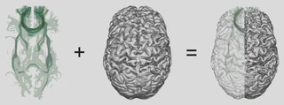
- Developed a “focus and context” visualization for probabilistic tractogram, consisting of 2 components:
- a nested isosurface visualization with variable transparency for the tractography data, and
- a viewpoint-aware “glass brain” rendering of the cerebral cortex to serve as context.
- Implemented both modules in C++ and GLSL, and integrated into OpenWalnut.
- Wrote a M.Sc. thesis and presented the results to a colloquium audience.
- Presented the results as a full paper at Visual Computing for Biology and Medicine and as a paper at IEEE BioVis.