Human Behavior

Picture this. It’s an average day. You wake up, brush your teeth, make coffee, and get ready for work. If you have a kid, you get them ready to go to school, and you might walk them to the bus stop down the road. You drive to work and start your computer. For lunch, you heat up your food in the microwave (or you go out to get food elsewhere). Perhaps you take a walk. On your way home, you stop by the grocery store, or maybe the gym. Once you get home, you make dinner, run a load of laundry, and relax to your favorite tv show before showering and getting ready for bed.
Humans behavior is at the heart of any city. At nearly every step throughtout the day, we use energy, whether it’s lights, driving, computers, food preparation (or storage!), or hot water for a shower. But even during a lunch-time walk, most people will bring a phone or smart watch.
Now, imagine trying to scale this up to try and understand, model, or predict the population behavior for an entire city, state, or country!
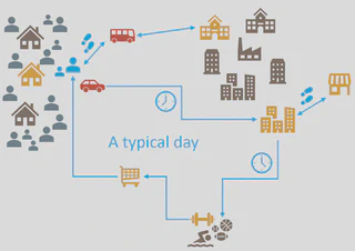
Building Occupancy…
As you might imagine from this example, building occupancy significantly impacts energy use and how it varies throughout the day. It affects the timing for demand impacts, and is a significant source of uncertainty in building energy modeling. Traditionally, building energy modeling uses static occupancy schedules. Below, I will share two different approaches which I have used to generate customized, more accurate schedules.
…from Simulated Traffic
My first work on building occupancy was part of the Urban Exascale Computing Project which explored the interactions between buildings, transportation, humans, and climate.
For this project, we used simulated traffic in the greater Chicago area (34sqkm). We used population models and survey data as inputs to the traffic model to represent population distributions, and human behavior and decision-making (e.g. typical departure times for commute). We used the traffic model outputs to determine arrival/departures near buildings, and produce building occupancy schedules.
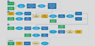
- Solicited traffic data from Illinois Department of Transportation (IDOT) for traffic models.
- Implemented coupling between population and transportation mode choice models and traffic simulations (TRANSIMS/SUMO) to generate realistic transit scenarios for an area of 34sqm in the Chicago metropolitan area.
- Designed and set up realistic, data-driven traffic scenarios for TRANSIMS.
- Set up parallel TRANSIMS simulation models which ran on Titan supercomputer.
- Implemented coupling between traffic simulation and building energy models (EnergyPlus) through occupancy.
- Optimized the computational complexity of generating occupancy data through the use of quadtrees, a recursive partitioning method.
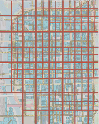
- Building Occupancy from Simulated Traffic
- Analysis of Weather Impact on Speed Patterns using NPMRDS traffic measurements and weather data.
…from Traffic Sensor Measurements
This work began with the installation of large numbers of traffic sensors in Chattanooga, Tennessee, which I was familiar with due to my traffic-related work. Due to the high coverage in the downtown area, I wanted to explore whether it would be possible to get close estimates for building occupancy.
Since the sensors provide data in real-time, it would be possible to determine real-time occupancy. This could be used as an input for real-time building management systems.
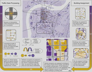
- Processed and managed traffic counts from over 30 IoT traffic monitoring devices.
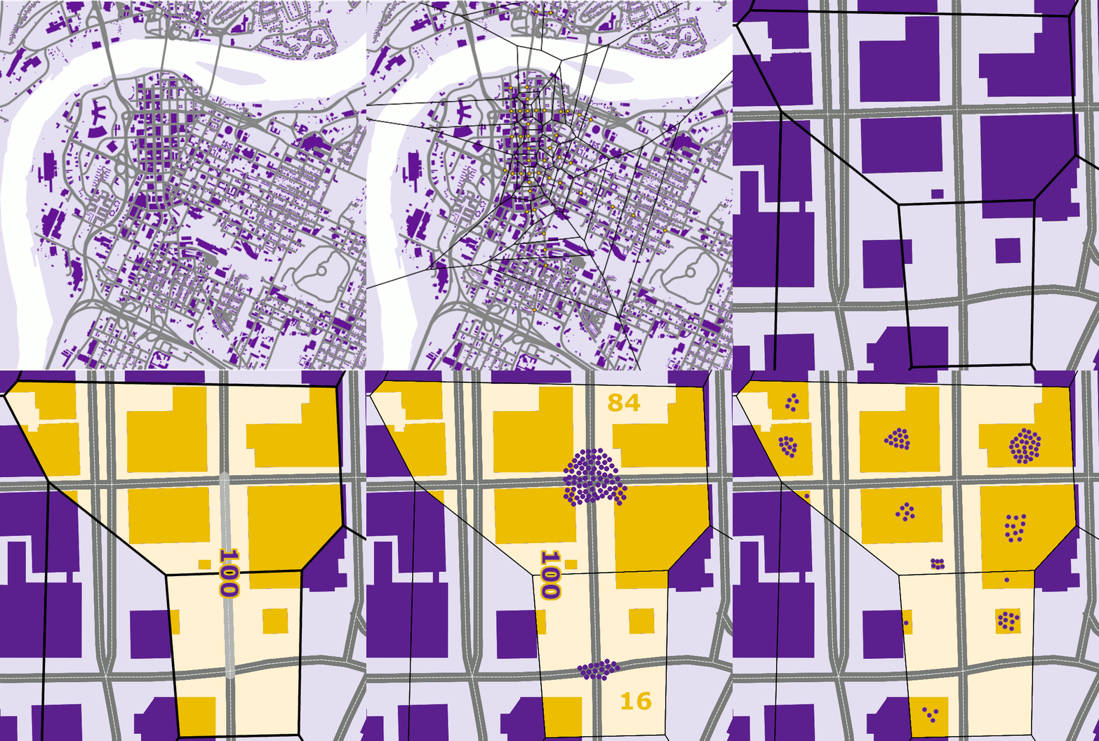
- Mapped the device topology to geographic locations and produced a Voronoi tesselation of the region.
- Determine which amount of floor area of each building falls in the different Voronoi cells.
- Determined arrivals and departures of vehicles between each pair of neighboring intersections.
- Used the topological mapping to assign the percentage of arriving and departing traffic to 600 buildings, based on proximity and building size.
If you’re interested in learning about my work on scaling up building energy simulation to national scale, check out my work on [automated building energy modeling]../buildings).
- Featured in STEM Magazine
- Featured in ACM TechNews.
…from Cellphone GPS Data
This work was part of a big project that studied the human dimensions of energy systems. Some of this work centered around modeling people’s willingness to participate in demand response programs from utilities. My project thrust team’s focus was to understand the impact that humans have on the energy system (e.g. increased energy use during heat waves and winter storms), and the impact of extreme weather and power outages on humans.
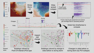
One major part of this work was to study human travel patterns. As most trips are taken for the purpose of visiting a specific destination, we used Point of Interest (POI) visit data which was derived from cellphone GPS data. This data tells us how which places someone visited, and how long. In the example of a typical day, the “trip chain” would be home (Census block group) ➡️ office ➡️ walk (if near POI) ➡️ office ➡️ grocery store ➡️ home.
As the overall objective of the project was to study the relationship to energy, we chose Winter Storm Uri as our case study. This winter storm caused widespread power outages in Texas. This caused behavior changes as people were stuggling to keep their homes warm. While overall travel dropped, gas stations were among the places which saw increased visits as many households resorted to using generators. Another increase was seen in the visits to community centers and large event spaces which served as cold shelters.
- Co-led a team of 5 researchers for 1.5 years of the project.
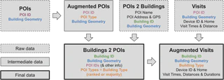
- Developed a HPC-based pipeline to process POI data from GPS traces.
- Determined detailed building occupancy based on POI visits.
- Processed, cleaned, de-duplicated, and enriched over 500GB of GPS data using parallelization (map reduce) on Kestrel supercomputer.
- Developed a hybrid method to combine deterministic and ChatGPT-based assignment of POI types to 130k POIs based on their business names.
- Conducted a case study analyzing changes in mobility and occupancy patterns during the 2021 Winter Storm Uri power outages in Texas.
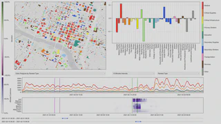
- Mentored a postdoctoral researcher and guided development of interactive visualization tools for the relation between power outages and human travel behavior.
Settlement and Building Detection in Satellite Imagery
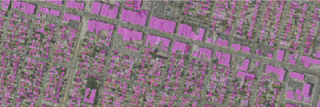
Humans generally live in communities, from small settlements to major metropolitan areas. For Western countries, we generally have a good understanding thanks to Census data. But in many countries, there is no comprehensive Census, others are developing so fast that Census data from a few years ago is already very out of date.
If a non-profit wants to deliver vaccines to everyone in an entire country, it’s important to know how many vaccines (and volunteers) they should send, and where exactly to send them.
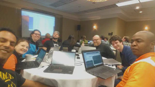
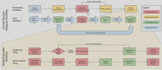
For this project, the team developed a workflow to run building detection and settlement detection for satellite imagery at unprecedented scale, using supercomputer Titan, which ranked 4th-7th in the TOP500 at the time.
- I managed a project team of 9 researchers to scale up settlement and building detection Convolutional Neural Network (CNN) workflows to full country scale.
- Developed a data workflow from local clusters and DGX boxes to deployment of deep learners on Titan.
- Build a portable large-scale image workflow for machine learning which is can be adapted to new problems and machines.
- Developed and optimized GPU-based image tiling technique to integrate in deep learning workflow (pycuda).
- Detected all buildings in Yemen in under 2 hours.
- Detected all settlements in Zambia in 3 hours 45 minutes.
- Detected all swimming pools in Texas in 20 minutes.
That last one was mostly for fun, but was relevant for an assessment of swimming pool health based on the amount of algae detected (most satellites include wavelengths outside the visible light spectrum, like infrared, which can be used to study biomass, vegetation, and more).