Weather can have a significant impact on the power grid. Heat and cold waves lead to increased energy use as customers cool or heat their space, while simultaneously hampering energy production as the environment deviates from ideal operating conditions. Extreme heat has previously melted power cables, while extreme cold can cause vital parts of the energy infrastructure to freeze. Utilities have reserves to compensate for the additional energy use, but in extreme cases which fall outside the forecast energy demand, the impact on the power grid can be severe. In this paper, we present an interactive tool to explore the relationship between weather and power outages. We demonstrate its use with the example of the impact of Winter Storm Uri on Texas in February 2021.
In IEEE EnergyVis 2024: 4th Workshop on Energy Data Visualization
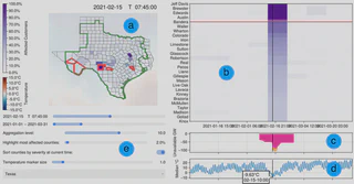
Sample analysis using the OutVis analysis tool. (a) shows the choropleth map of the outage data for a selected state at a specific time, with an optional temperature data overlay. Users can select counties in view (b) and highlight them with red outlines. The Texas Interconnection boundaries are displayed in green. (b) displays the temporal outage severity for every county of the state. Counties can be sorted by severity at the specified time (black bar). The red bar indicates the threshold of the n % most affected counties, as selected by the user. (c) shows power generation shortages (pink) and load shedding (orange) and (d) displays the median temperature over time. Finally, the tool provides data exploration options (e) to select the time range, the specific time, the aggregation level for severity, or set the threshold to automatically highlight the most severe outages, control of temperature overlay in (a), and state selection.